

Knowing how to build a brand style guide from scratch is one of the most valuable skills you can develop as a beginner brand strategist, because almost every company, big or small, eventually needs one. A brand style guide is the rulebook that keeps a company's visuals and voice consistent, whether it's a social media post, a pitch deck, or a product label. Without one, brands drift: colors shift slightly between platforms, the tone of voice changes depending on who's writing, and the whole identity starts to feel inconsistent.
Why a Brand Style Guide Matters More Than It Seems
A style guide isn't just a design reference; it's a decision-making tool. When a new hire, a freelancer, or an agency needs to create something for the brand, the style guide answers questions before they're even asked. As a result, a company with a solid style guide moves faster and looks more professional, because nobody is guessing which blue is "the" blue or whether the logo can be stretched to fit a banner.
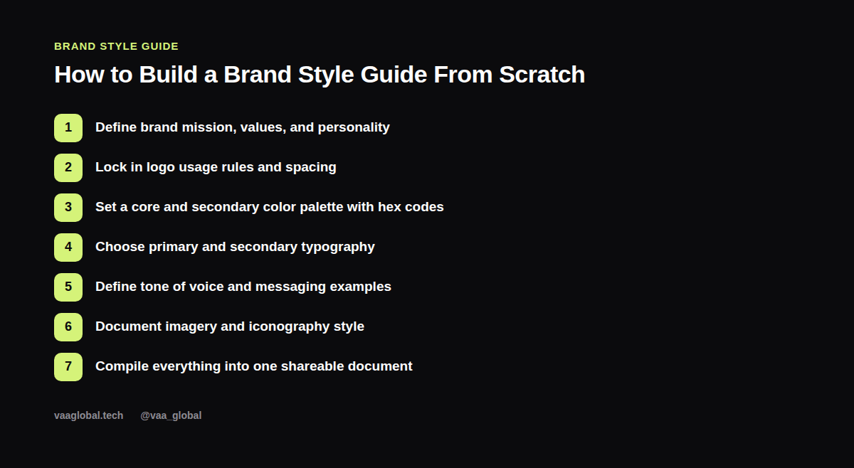
Step 1: Define the Brand's Mission, Values, and Personality
Before any visual decisions, write down the brand's mission in one sentence, three to five core values, and a short personality description (for example: "confident but approachable, never corporate-sounding"). This section grounds every later decision. If the brand ever has to choose between two font options or two color palettes, the personality description should make the choice obvious. For more on the strategic thinking behind this step, see our article on what is corporate branding and strategy.
Step 2: Lock In Logo Usage Rules
Document exact clear space requirements (how much empty space must surround the logo), minimum size for print and digital use, and a clear list of what's never allowed — stretching, recoloring, or placing it on a busy background. Include the logo in every approved format: full color, single color, and reversed for dark backgrounds.
Step 3: Set a Color Palette With Exact Hex Codes
List your primary color, secondary colors, and any accent colors, each with its exact hex code (and ideally RGB and CMYK values too, for print use). Vague color direction causes more inconsistency than almost anything else in a brand, so being precise here saves headaches later.
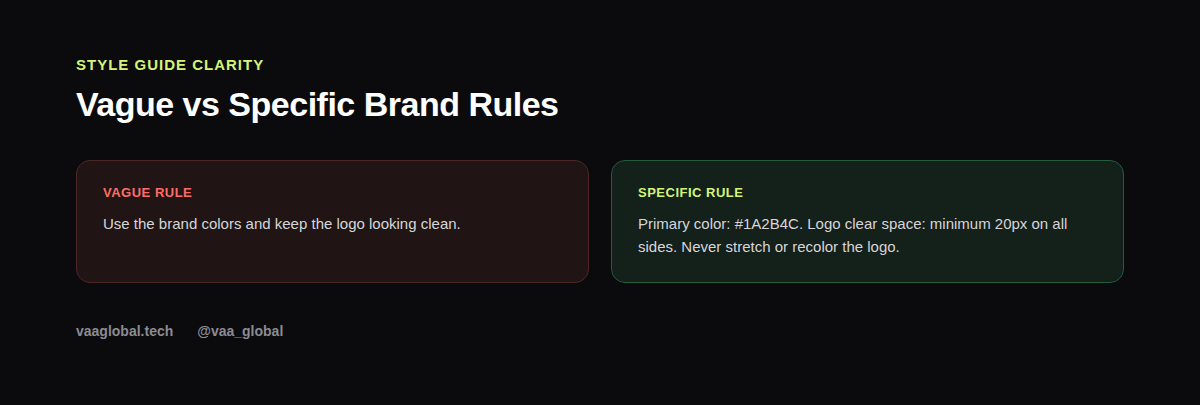
Notice how the specific version in the image above leaves no room for interpretation. That precision is exactly what separates a usable style guide from a decorative one that nobody actually follows.
Step 4: Choose Primary and Secondary Typography
Pick one primary typeface for headlines and one secondary typeface for body text, and specify weights and sizes for common use cases like headings, subheadings, and captions. If budget allows, choose fonts with good web and print support so the brand looks consistent across every channel.
Step 5: Define Tone of Voice With Real Examples
Tone of voice is often the most skipped section, but it matters just as much as visuals. Write a short description of how the brand sounds (playful, formal, warm, direct) and include two or three real example sentences showing it in action, plus an example of what the brand would never say. This turns an abstract idea into something a copywriter can actually apply.
Step 6: Document Imagery and Iconography Style
Describe the kind of photography, illustration, or icon style the brand uses — bright and candid versus moody and cinematic, for example — along with a few approved sample images. This prevents mismatched visuals from creeping in when different people source images for different projects.
Step 7: Compile Everything Into One Shareable Document
Finally, bring every section into a single, well-organized document or page, ideally something that's easy to update as the brand evolves. A simple PDF or a shared Notion page both work fine; what matters is that everyone on the team can access the latest version without confusion.
Using a Brand Style Guide Template to Move Faster
If you don't want to start from a blank page, a brand style guide template can speed things up considerably. Most templates already include placeholder sections for logo usage guidelines, a brand color palette grid, typography samples, and brand tone of voice notes, so you just fill in the brand-specific details. However, be careful not to let the template dictate the brand's personality; use it as a structure, not a substitute for strategic thinking. Beginners often ask what should be included in a brand style guide beyond the basics, and the honest answer is: enough detail that someone who has never met the brand could still apply it consistently.
Common Mistakes Beginners Make
New brand strategists often jump straight to colors and fonts without defining the brand's personality first, which leads to a style guide that looks nice but doesn't actually reflect the brand. Another common mistake is being too vague ("keep it modern") instead of specific and testable. If you want to practice this skill hands-on, our guide on corporate branding portfolio projects for beginners includes a full style guide exercise.
The Bottom Line
Once you understand how to build a brand style guide from scratch, you have one of the most practical, in-demand skills in corporate branding, since nearly every business eventually needs this document and few people actually know how to put one together properly. Start with strategy, move to visuals, and always be specific rather than vague. For a structured path through this and related skills, our 10-week Corporate Branding and Strategy course covers brand fundamentals, brand strategy, brand identity, brand research, brand communication, digital brand management, and rebranding. For related reading, see brand identity design basics for beginners and the corporate branding skills employers actually want. Design guidance from the Material Design system is also a useful external reference for thinking about visual consistency at scale.